Most running apps end up handing you a single number: VDOT, running fitness, a condition score. One number is easy to read — the problem is that two people with the same score won't necessarily fall apart in the same place. One might hit the wall at 30 kilometers; the other only starts fading on the last couple of interval reps. We spent several months going through 8,966 training sessions and more than 400 runners, and in the end we decided running fitness has to be read on two axes.
The same score, completely different weaknesses
That gap isn't our own guesswork. The classic three-parameter model (maximal oxygen uptake, fractional utilization at lactate threshold, running economy) together explains only about seven-tenths of the variance in marathon performance; the remaining three-tenths never had a good name.
In 2024, exercise physiologist Andrew Jones gave that piece a name: physiological resilience. Even with identical maximal oxygen uptake and threshold, some runners look almost unchanged two hours into a run, while others fell apart long before. Running ability isn't only about how strong you are at your best — it's also about how long you can hold it.
VDOT measures the former. It works backward from race results to give different runners a common yardstick, and we're not throwing it away. But the latter only becomes visible once time stretches out and fatigue accumulates — which was never the question VDOT set out to answer.
The question we wanted to ask wasn't "how do we compute VDOT more accurately," but "what happens after fatigue sets in, and can we see it in everyday training data?"
Axis one: aerobic capacity — how far you can hold it together
Run long enough at a fixed pace and your heart rate usually creeps upward. This is cardiovascular drift: heat load and dehydration pile up, each beat pushes less blood, and the body compensates by raising heart rate.
In our data, drift doesn't show up at random — it accumulates step by step. The farther the same person runs, the more drift rises; of 103 runners, 90 pointed the same direction. We tried five different ways of measuring it, and only one caught the signal. The reason isn't complicated: drift accumulates with absolute time, not with "what percentage of the run you're in." If the reference window is cut proportionally — say "the last 10%" — you end up dividing out the very factor that matters most: how long you've been running.
But little drift doesn't automatically mean good capacity. Run slow, run short, and drift will naturally be small. So this axis looks at three things together: the distance actually covered, the drift at that distance, and the relative pace level of that session. Distance isn't a "confounder to control away" either — it is part of the capacity itself.
This is information we deliberately left in: the score correlates strongly with your long-run distance, and we did not "correct that away." For the marathon, whether you can hold together out to 30 kilometers is capacity, not a data artifact.
Axis two: speed endurance — how fast you fade at high intensity
Research on speed endurance comes mainly from football and middle-distance running, and Jens Bangsbo's framework splits it into "production" and "maintenance." Distance running cares about the latter: not just how fast you can go, but how fast you fade over repeated high-intensity efforts.
We tried two routes that look beautiful in theory but don't survive contact with the data we actually have. Those failures matter too, because they mark out where the data ends:
- The critical speed + D′ model: it requires extrapolating along the time axis to near zero. A typical runner offers only about three performance points, and they all sit bunched together. The extrapolation distance is comparable to the span of the data itself — what comes out of that isn't an estimate, it's a guess.
- Anaerobic speed reserve (ASR / SRR): this model needs a genuine maximal sprint speed. But in our population, the median fastest 10-second pace is 3 minutes 36 seconds per kilometer — that isn't a sprint. These runners don't sprint, so the model has no input.
What ended up working is self-referencing: instead of asking "how fast is he," ask "within the same session, how much did the later part drop off from the earlier part?" We look at four near-orthogonal facets across interval sessions and steady-pace sessions: the drop-off of the later reps relative to the best one, decay within a single rep, pace stability, and the drop-off in the second half of a continuous run. Each facet sees something different; only together do they make up this axis.
But self-referencing has a blind spot: it can't see absolute speed. Take the same 16 × 400 meters, same heart rate, same drop-off — one runner at 3-minute pace and another at 5-minute pace would get nearly identical scores from those four facets, which clearly makes no sense. So this axis deliberately keeps a portion of VDOT in the mix, so different runners remain comparable. The aerobic capacity axis follows the same principle.
Putting the two axes side by side
We plotted the two axes as X and Y in a scatter chart and colored the points by marathon finish time. 184 runners have a score on both axes, and 92 of them have a marathon on record.
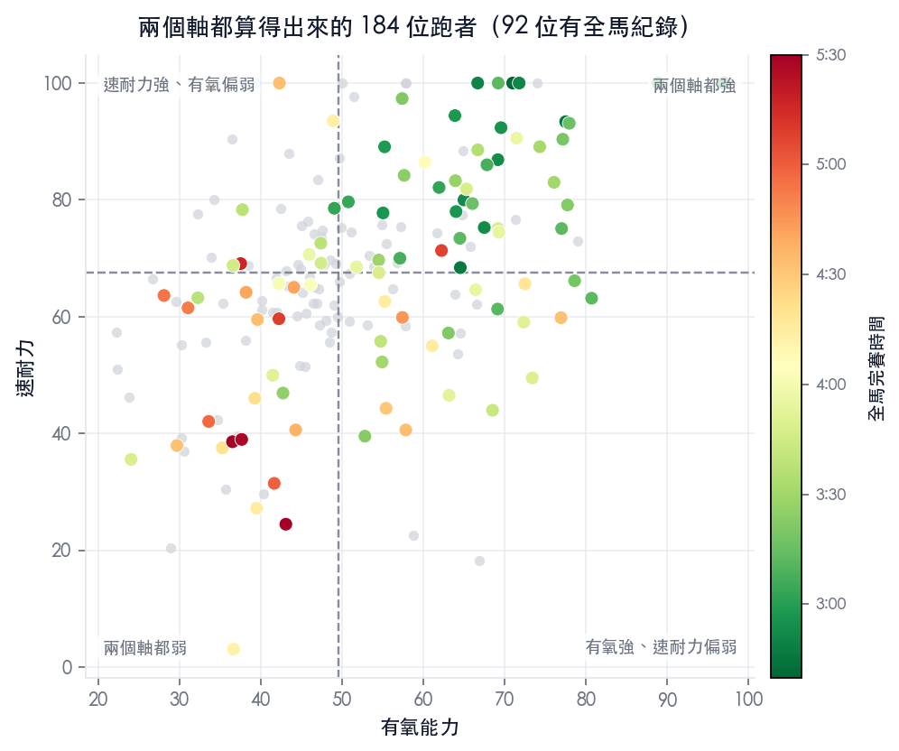
The first thing to ask is basic: are the two axes actually describing the same thing? If they are, forcing them apart is pointless.
The correlation between the two axes is +0.42, less than twenty percent shared variance. They are related — fit runners tend to be decent on both sides — but most of what each carries is still independent information.
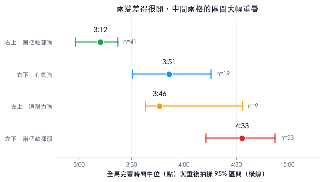
Next, the median marathon time in each quadrant:
| Quadrant | Runners | With marathon | Median marathon |
|---|---|---|---|
| Upper right strong on both axes | 61 | 41 | 3:12 |
| Lower right strong aerobic, weaker speed endurance | 31 | 19 | 3:51 |
| Upper left strong speed endurance, weaker aerobic | 31 | 9 | 3:46 |
| Lower left weak on both axes | 61 | 23 | 4:33 |
The strongest runners cluster tightly in the upper right. The two ends differ by 81 minutes, and resampling puts that interval at 59 to 104 minutes — this isn't coincidence. It's a distinction a single metric can't draw; look at only one axis and the upper right blurs into the upper left (or the lower right).
The two middle cells are a different story, and no such conclusion can be drawn there. 3:51 and 3:46 look like one is better than the other, but only 9 people in the upper left have a marathon on record; after resampling, the gap between the two cells spans more than half an hour in either direction. In other words, with the sample we have, we cannot tell whether "strong aerobic, weak speed endurance" or "strong speed endurance, weak aerobic" runs faster. That's a question the data has to answer; we don't get to pick an order and write it down. Answering it for real means waiting until more runners have marathon results.
Finally, the 15 sub-three-hour runners in the population:
All 15 sub-three-hour runners sit above the population median on aerobic capacity, without a single exception. Their median speed endurance percentile is 89, and their median aerobic percentile is 84.
When a score "looks wrong," find out why first
When a score comes out unusually high or unusually low, don't jump to declaring the metric broken. What actually matters is whether you know why it's an outlier.
Among those 15 sub-three-hour runners, the two lowest aerobic capacity scores were 55.0 and 55.2, well below the 63 to 97 of the rest. Dig down and the reason is straightforward: their longer sessions only reached 18.7 kilometers and 16.2 kilometers. Put those 15 runners' scores next to their longer sessions and the correlation is +0.94 — the score is very nearly just describing how far they've been running lately.
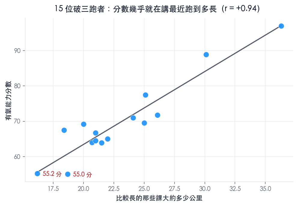
This isn't the metric misfiring — it's that they haven't been running long lately. Someone capable of 2:56 can obviously handle 30 kilometers, but if that season's training contains no such session, we have no data to show it. The score reflects only what we've seen; it doesn't guess on your behalf how strong you "should" be.
So the system can't just drop a number on you. Every score comes with a sentence explaining where it came from:
"Your longer sessions are running about 18 km. This score is mostly about how far you can hold a steady effort — to move it up, your long run needs to reach around 23 km."
That sentence isn't a fixed template; it's computed live from your own data, telling you how far off you are and where to fill the gap next. But if the score is low simply because there isn't enough data yet, the wording changes to this:
"Not enough history yet: we're only covering 8 weeks and 7 aerobic sessions. The score settles once you reach about 8 weeks and 12 sessions (roughly half a training cycle) — until then it usually reads a little lower than reality."
These two sentences say completely different things: one means "the score is accurate, but your training content can't support a higher one"; the other means "there isn't enough data yet, so the score itself will still move." Blur them together and users just feel the system is hedging.
When we can't compute it yet, say exactly what's missing
In our data, 282 runners have at least one axis we can't compute yet. Leaving a blank there, or forcing out an unreliable number, helps nobody.
Instead we tell them exactly how much is still missing: 83 of them need 1 to 2 more aerobic sessions before aerobic capacity can be computed, and 84 need one more speed session before speed endurance can be.
"Speed endurance isn't available yet: you have 2 speed sessions so far, plus 4 more that weren't counted because the structure couldn't be read. You need 2 sessions at the same rep distance, or 2 steady-pace sessions (3–10 km, second half at threshold heart rate)."
This particular problem was caught by our founder using the app himself. I had clearly run intervals, and the system still told me "we haven't seen your interval sessions yet." Digging in, it turned out the sessions were being read fine — they were being filtered out by an upstream classification rule. In the end we fixed more than the message: the rule itself changed too. After loosening it, the number of usable interval sessions rose by about forty-three percent, the metric's repeatability barely moved (the difference sits inside resampling noise), and its correlation with race results even improved slightly.
Two questions worth answering separately
These two axes aren't meant to replace VDOT — they fill in the part it was never answering: where your ceiling is and how long you can hold it are two different things.
Runners in the upper right can do both. Runners in the lower right hold endurance well but fade at high intensity; runners in the upper left can go fast but can't stretch it out. Knowing which cell you're in is more useful than knowing a single score, because it also makes clear what the next cycle needs to fill in.
Both axes are computed from ordinary training data — no extra test, no race required.